
- Client
- Yokohama
- Services
- Merchandise
- Social Media
What is a Mumbai-based, creative advertising agency, with a strong focus on brand communications, digital marketing and retail branding, doing with a Japanese global leader in tyres? That could well be the question on anybody’s lips when told that Water Communications handles collateral output and social media requirements for Yokohama–ATG, the business unit of the OHT Division of Yokohama Rubber Company, Japan.
All we can say is that, by their very nature, Japanese global giants can be very precise and choosy with whom they outsource their communications to, and Water fit those precise requirements.
Certainly, the assignments were below-the-line – designing for catalogues and calendars – but, as always, we brought value to the table that helped lift the brand communications several notches higher than was expected.
Yokohama–ATG inherits its DNA from its parent. As a brand, Yokohama Rubber is highly technical and customer-centric, and the nature of its product – heavy-duty tyres for massive vehicular equipment and machines – even makes the brand earthy and rustic. At the very same time, the thinking and technology that goes behind the product are sophisticated and superior. The brand’s intention is to deliver maximum value to the customer, without any compromise on quality.
We at Water Communications carefully analysed the brand personality and mappedthat to its specific requirements. The core requirement was designing of product catalogues and a calendar. The question we asked ourselves was: How can we make an industrial and technical brand interesting and creative?
Simply put, we pride ourselves in being in the business of ‘interesting and creative’. As a 360 o creative advertising agency, we are fully equipped to handle every kind of communications requirement. Our ability to slide between creative and technical, conventional and digital, and from medium to medium is almost seamless. Over our timeline, the sheer diversity of clients we have handled, has made us nimble, fleet-footed and versatile.
We understood that Yokohama is not an FMCG or day-to-day brand. Its customers, or at least those who make the decisions for them, are technical by nature. That is why the brand historically uses direct and conventional visualisation and imagery in its communication. The delivery is generally text and data heavy.
Which is all very fine for a brand that needs to hard-sell. However, examining the media we were tasked with (Catalogues and Calendar), we felt there was enough width to be creative without compromising the brand’s existing persona. We realised we could deliver a visually rich experience within the ambit of ‘product-hero’.
As a value add, we felt the brand needed to enhance its Social Media presence – for the simple fact that brand communication doesn’t always have to be about hard-sell… brand visibility is just as important in this digital age.
Yokohama–ATG handles two tyre brands of Yokohama Rubber – Alliance and Galaxy. Our task was to design a calendar each for Yokohama–ATG and Alliance, and product catalogues for Galaxy.
Galaxy offers a range of tyres to suit different vehicular applications and terrain. We could have gone the conventional route and merely shown the tyres in application, but we strongly felt that such a huge global brand needs to do a bit more. Once again, we endeavoured to venture beyond the obvious and not merely create a product catalogue, rather deliver a visual experience.
One suggested route focussed on the application terrain (Agriculture, Forestry etc), and for these we gave it an offbeat visual treatment. The other option was even more innovative. This route put the spotlight on the vehicular equipment, but with just the tyres in their actual form.
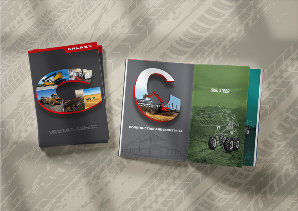
The rest of the vehicle or machinery was rendered as simple line drawings, so that the tyres stood out prominently, and yet leaving no doubt whatsoever, what equipment they belonged to.
The final outcome was elegant and highly impactful.

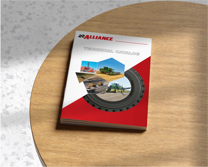

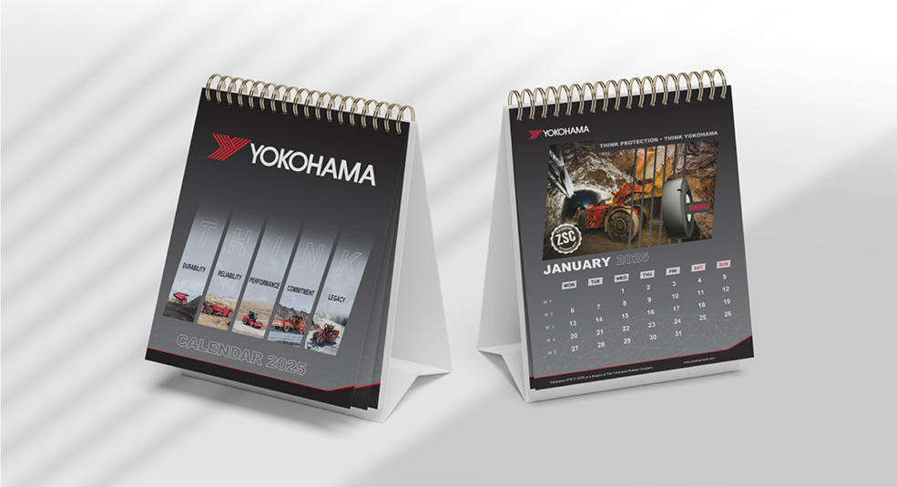
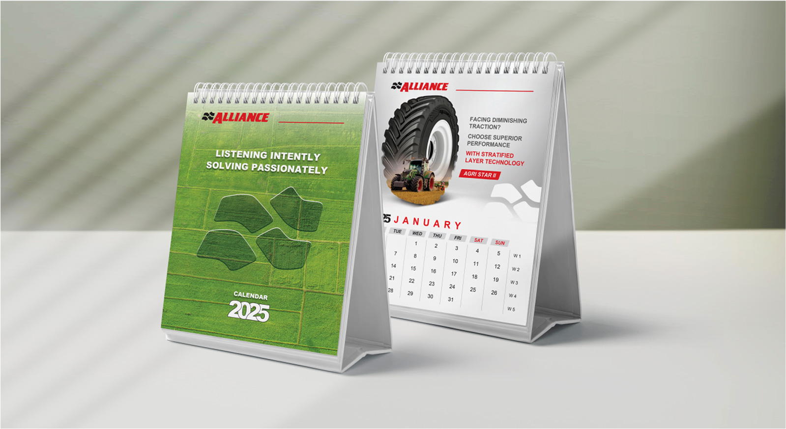
By its very nature, a calendar allows for creative and visual-richness. It is not a hard-selling medium; in fact, it has to come across as visually-appealing – something that anybody would want to put on their wall or desk.
And yet, we couldn’t afford to be creative for creativity’s sake. There had to be a fine balance between creativity and existing brand personality. This we achieved by addressing various tyre-customer issues and the corresponding Alliance (Yokohama) solution – one per each month-page.
However, the hero of the page remained the larger-than-life tyre, which we creatively blended with its respective application.
Thus, without losing out on the creative aspect, we were able to stay within the client’s DNA of being a rustic and technical brand, and in an aesthetic manner ship across twelve product values/benefits – Protection, Endurance, Adaptability, Toughness, Resilience, Efficiency, Stability, Tranquillity, Technology, Supremacy, Superior Grip, Versatility.
For the Yokohama calendar we focussed on the same twelve values, however with a very different makeover. Application and product were creatively blended into a singular imagery, with the anchoring thought being ‘Think Yokohama’. The overall look-feel-see was corporate.
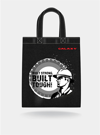
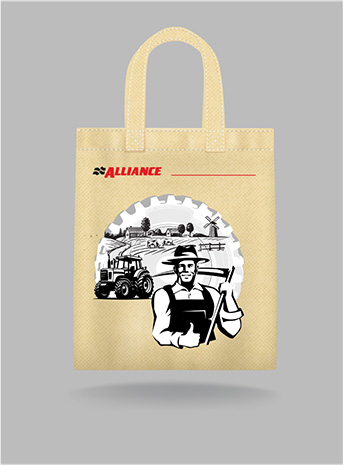
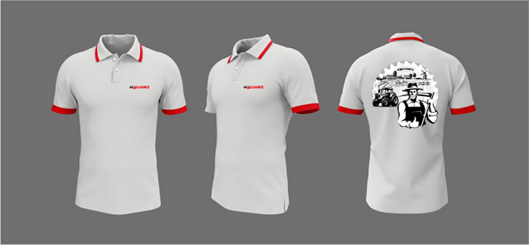
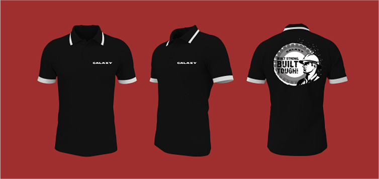
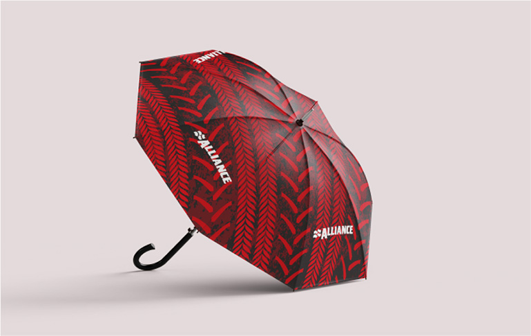
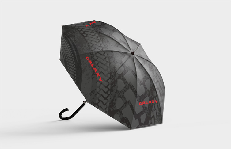
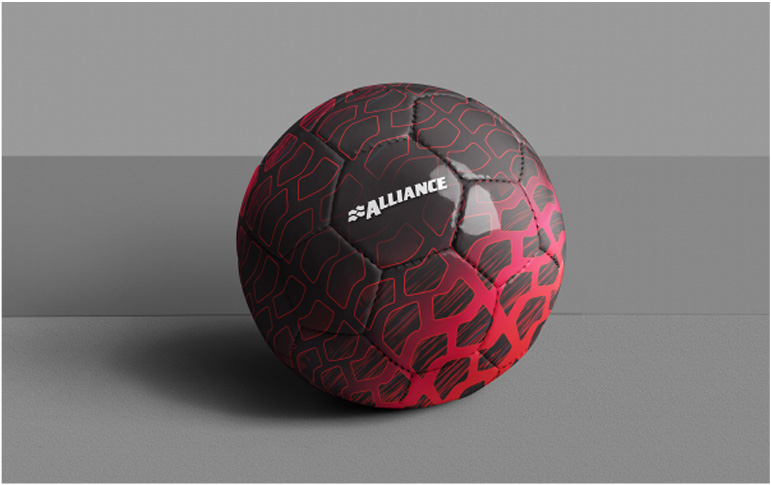
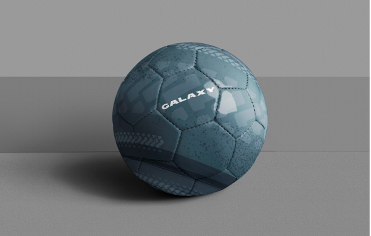
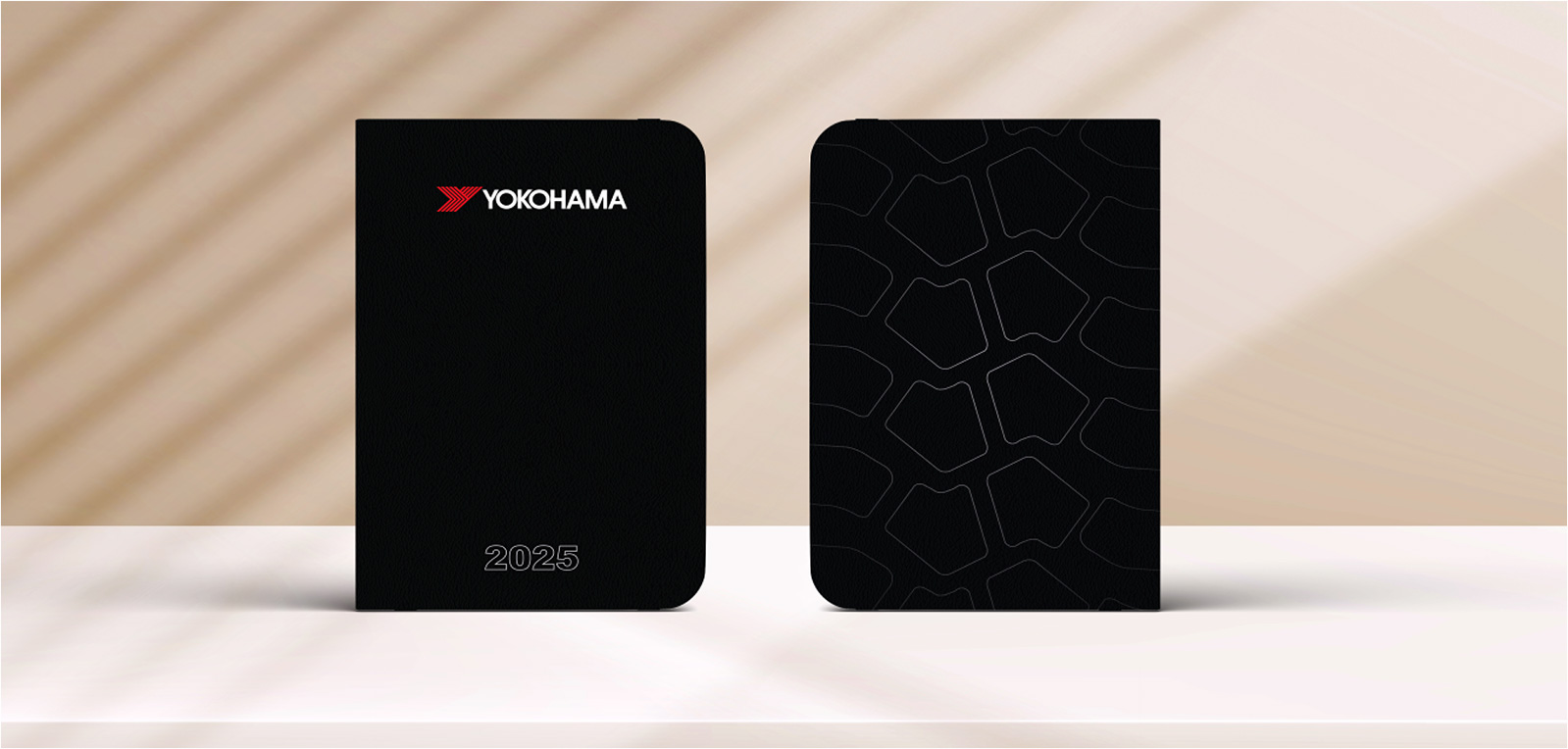
Brand merchandise usually serves as a tool to enhance customer goodwill and loyalty. When Water Communications was tasked with handling collateral and BTL communications for Yokohama-ATG, we saw merchandise as an excellent branding opportunity to forge a deeper connect with on-field and offshore personnel and increase visibility of the brand.
Yokohama’s tyres are widely used across industries like mining, agriculture, construction, and earth-moving, where most of the work takes place outdoors. Workers, contractors and engineers are constantly on-site in the field, mines, or construction areas – braving the elements. Providing them branded umbrellas is a thoughtful and practical gesture, offering daily utility while increasing brand visibility. Umbrellas symbolize protection and resilience – qualities that align perfectly with durability and strength that Yokohama tyres are known for.
Our suggestions didn’t end there. Staying with the core audience, we discovered that workers and engineers need to log notes and record important details while working onsite and offshore. So, we came up with the idea of Yokohama-branded diaries, along with carry bags in which to store them, and enable their all-weather usage.
Sport is a popular escape and pastime for workers and contractors deputed to off shore locations. We zeroed in on football, being the world’s most popular sport, and suggested Yokohama-branded footballs, which would result in brand visibility and recall, while engaging in a pleasurable leisure activity, thus increasing endearance for the brand. It also gave the brand an active, dynamic image, while symbolising team work, resilience and performance.
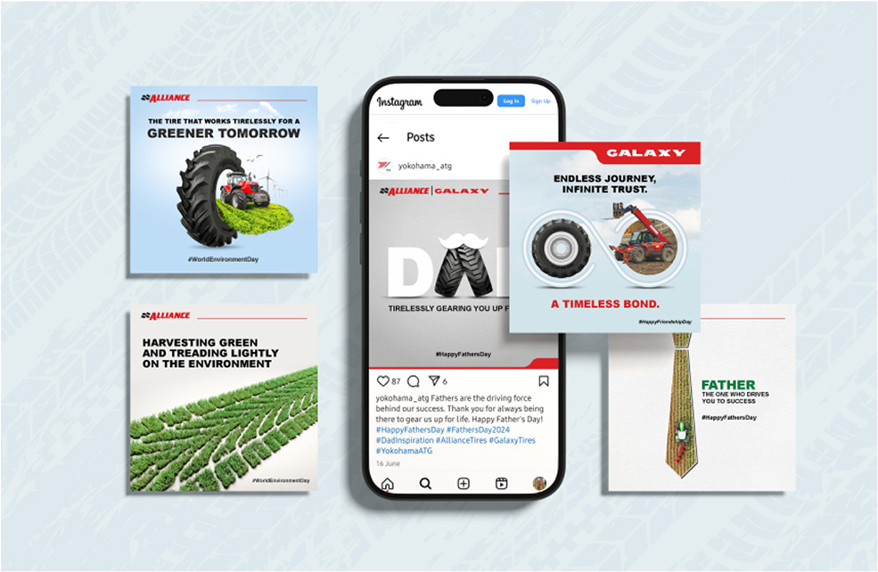
Nobody is over going to make a purchase decision for heavy-duty, industrial tyres on the basis of what they see on an Instagram page. However, being a creative advertising agency with a deep equity and involvement in digital and social media, we are acutely aware of the need for every brand to have a social presence.
This not only gives it visibility, but can provide product updates, elicit reviews, etc. The basic premise of social media is that almost everyone is on it – even professionals with technical and industrial backgrounds. Every professional is a human being first and hence also attracted to creative stimuli and inputs.
In any case, even reaching the general public who are not direct customers isextremely beneficial for any brand in this digital age. A digital presence these days is inescapable. People are constantly checking the more visible Instagram handles regardless of whether they are a customer of the brand or not.
Beyond innovative visuals and smart creativity, we ensured that every post has some interest value – be it live videos from application sites or engineers talking about the product.
